Brand Assets and Guidelines
Welcome to the HikeOrders brand assets and guidelines. In these pages you’ll find information about our brand guidelines and you can also download our band assets for use on your website.
HikeOrders logo and symbol
Accessibility Enabler logo and symbol
Accessibility Checkup logo and symbol
Product Home | How It works | Pricing
Colors
Primary Colors
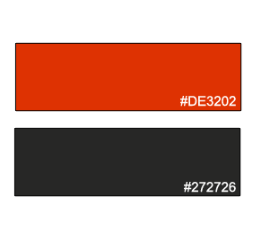
The following 2 colors are our HikeOrders colors. We use them in our logo, marketing collateral, and on our website.
- Scarlet : #DE3202
- Eternity : #272726
Secondary Colors
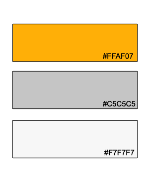
We use the following colors as accents to our primary palette in software.
- Orange : #FFAF07
- Silver : #C5C5C5
- White Smoke : #F7F7F7
Supporting Colors
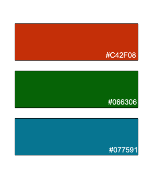
We use the following colors as supporting colors in our software.
- Rust : #C42F08
- Green: #066306
- Eastern Blue : #077591
Typography and Fonts
Brand Font
We use a font called Baloo Da 2 for all our logos. This font in the HikeOrders logo, product logos, and HikeOrders property logos.
Font Styles : 800-Normal
Secondary Font
We use Open Sans as a secondary font in all our marketing collateral. This is mainly used for text content.
Font Styles : 400-Regular , 800-Italic , 600-Normal, 700-Normal, 800-Normal
Brand Architecture
Brand Symbol Construction
Our symbol is based on the simple pattern. The pattern is carefully constructed to embed the brand values , principles and characteristics into this pattern. This pattern serves as a universal signature for both the company symbol and it’s product symbols.
This pattern makes use of primary brand colors . It has Scarlet color ( #DE3202) in the background and white ( #FFFFFF) running band with 6 white dots. These six dots stand for 6 principles of our WHITES Framework .
The area inside the circle is reserved for adding brand related or sub brand related elements.

Brand Name Construction
Main Brand
- Main brand logo is a combination of 2 major colors - Scarlet (#DE3202) and Eternity (#272726)
- The Scarlet color is always used first and Eternity color is always used later.
- There is no space between the word “Hike” and “Orders”.
- The First letter of First word and First letter of second word are always capital
- The text is written in the brand primary font (Baloo Da)

Sub Brand
- Sub brand logo is a combination of 2 major colors - Scarlet (#DE3202) and Eternity (#272726)
- The Eternity color is always used first and Scarlet color is always used later.
- There is always a space between the words of the sub brand name.
- Sub brand name will always include combination of 2 words
- The First letter of First word and First letter of second word are always capital
- The text is written in the brand primary brand font (Baloo Da)

Need more brand resources ?
Just get in touch with us.We are happy to give you more details about our brand.
Contact Us