Accessibility Contrast Checker
Definition
It is a tool that checks and suggests the best contrast between background and foreground colors.
Meet complete Accessibility Solution that is easy to install and highly customizable. With intelligent and breakthrough design for mobile and desktop, it works flawlessly on any website design.
Explanation
Which one can you read better?
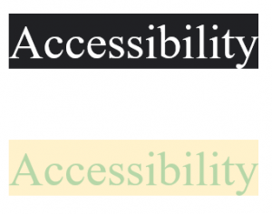
Of course, it is the first option. Isn’t it? Because it is more clearly visible to human eyes. We humans are more attracted to colors than words. So you have to carefully choose the colors to use on your website.
Contrast ratio plays an important role in your website. When you have specially-abled users visiting your website you have to be more specific about the colors used on your website.
This is where accessibility contrast checker will make your job easy. It checks different combinations of foreground and background colors and suggests you the best one.
You can use a contrast checker before you build your website. Or you can also use it for testing the accessibility of your website.
WCAG defines certain standards for the contrast ratio of a website:
- Level AA requires a contrast ratio of at least 4.5:1 for normal text and 3:1 for large text.
- WCAG 2.1 requires a contrast ratio of at least 3:1 for graphics and user interface components.
- Level AAA requires a contrast ratio of at least 7:1 for normal text and 4.5:1 for large text.
Make your website a better place for everyone
Accessibility Enabler helps thousands of people to overcome their disability every month. Add an accessibility toolbar to your website and build a better society around yourself. Start making your contribution from today.
Try For Free