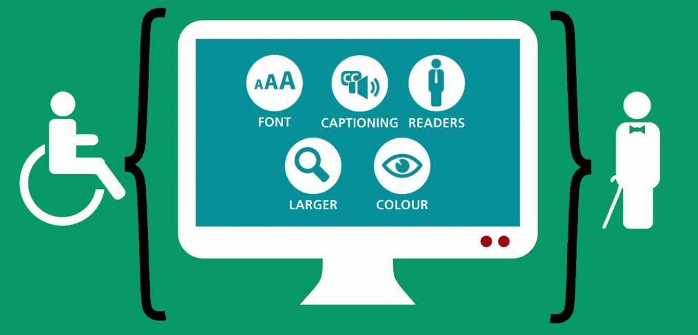
Introduction to ADA Compliance for Websites
Hey there! Do you know how we have ramps and elevators in buildings so that everyone, including those with disabilities, can access them easily?
Well, the internet has something similar called ADA compliance. I’m here to teach you about it. Just like those ramps make physical places more accessible, ADA compliance ensures your website is welcoming to all, including those with different abilities.
Now, you might wonder why this is important. Imagine if some of your friends couldn’t join a fun game or activity because they didn’t have the tools they needed. That would be sad, right? The same goes for websites.
When your website meets ADA standards, it means everyone, regardless of their physical or cognitive abilities, can browse, learn, and have fun. I am here to guide you on how to make sure your website is a friendly space for everyone!
Let’s get started with some foundational things you should keep in mind while you are creating your website.
Choose the right colour contrast
Imagine for a moment that you’re trying to read a book, but the words are almost blending into the page because the ink is too light. Frustrating, isn’t it?
This is how some people feel when visiting websites where the colour contrast isn’t optimal. When we talk about your website, especially your logo and design, the contrast between the text and background colour is crucial for accessibility.
For those who might not know, contrast is the difference in brightness between the text (or any element) and its background. A proper contrast ensures that everyone, including those with visual impairments, can read and understand the content on your website easily.
When your website is designed with the right colour contrast, it becomes more user-friendly, and you’re signalling to your visitors that you care about their experience.
Now, let’s get a bit technical but still simple. The best contrast ratio for text and background is at least 4.5:1. This ratio ensures that the content remains legible to a broader audience, including those with colour blindness or other visual challenges.
There are handy online tools that can help you check these ratios, making it easier for you to pick the perfect colour combinations.
In wrapping up, think of your website’s colour contrast as the clarity of a conversation. Just as you’d want your words to be clear and understood, your website’s colours should enable easy reading and navigation.
By being mindful of this aspect, you’re taking a significant step towards making your website more accessible and welcoming for all.
Choose the right website theme
When setting up your website, one of the first things you probably think about is its appearance. Just like picking the perfect outfit for an occasion, choosing the right theme for your website sets the tone.
But there’s more to a theme than just how it looks. If I told you that some themes are like superhero outfits equipped with special features to help more people access your website, would you believe me? Well, it’s true!
Accessibility-ready themes are crafted with special attention to ensure everyone, no matter their abilities, can navigate and understand your website. Think of it as a bridge that helps all your visitors come and enjoy what you have to offer.
When a theme follows accessibility best practices, it means that things like colour contrast, font sizes, and keyboard navigation are already taken care of. It’s like getting a car with all the safety features pre-installed.
Now, you might wonder, “Why can’t I just pick any theme and tweak it later?” You can, but starting with an accessibility-ready theme saves you a lot of time and effort.
Plus, it provides a strong foundation ensuring you don’t unintentionally leave anyone out. It’s akin to buying a house that’s already built to be earthquake-resistant rather than retrofitting it later.
So, the next time you’re on the hunt for the perfect website theme, remember to look for those that prioritize accessibility.
It’s not just about having a beautiful digital space; it’s about creating a welcoming environment where every visitor feels valued and catered to. And believe me, that’s a decision you’ll be proud of.
Choose the right content management system
Building a website is a lot like constructing a house. The foundation and the materials you use are crucial.
In the digital world, one of the primary materials is the Content Management System or CMS for short. Now, if you’re wondering what a CMS is, think of it as the toolbox you use to build and manage your website. And just like any toolbox, some are more equipped than others, especially when it comes to accessibility.
Selecting a CMS that has accessibility features built-in is a game-changer.
Why? Because it does half the job for you! With the right CMS, creating an ADA-compliant website becomes more straightforward. Instead of figuring out how to add accessible features yourself, a good CMS provides tools and options that guide you in making content that’s inclusive from the get-go.
It’s like getting a recipe with step-by-step instructions versus one that just lists the ingredients.
Now, I understand that with so many CMS options out there, it might feel overwhelming.
But here’s a tip: when you’re evaluating your choices, look for those that actively promote their accessibility features. These systems not only make it easier for you to comply with ADA standards but also ensure that all your visitors have a pleasant experience on your site.
In conclusion, the right CMS is your ally in building an accessible website. By choosing one with built-in accessibility features, you’re setting yourself up for success and creating a space that’s welcoming for all.
Remember, in the digital world, inclusivity is not just a buzzword; it’s the way forward.
Now that you know all the foundation things to take care of and why, let’s get on to make your existing website accessible.
Perform Accessibility Audit
Building a website that’s ADA-compliant is a fantastic step, but how do you know it truly meets all the standards?
Just like you’d take a car for an inspection to ensure it’s running smoothly, your website needs an accessibility audit. This process checks if your website is genuinely friendly and usable for everyone.
Let’s dive into two methods: automated testing and manual testing.
Automated testing is like having a robot scan your site for any accessibility issues. It’s a great starting point because it’s quick and can pinpoint many common problems. There are some nifty tools out there, such as WAVE, AXE, or Lighthouse, that can help with this. These tools will browse through your site and give you feedback on areas that might need some tweaks.
However, while robots are smart, they can’t catch everything. That’s where manual testing comes in.
Think of it as walking through your house and checking every nook and cranny.
For your website, it involves real people using various tools and technologies, like screen readers, to interact with your site. This hands-on approach can uncover issues that automated tools might miss, ensuring that you’re not unintentionally leaving anyone out.
I’d recommend starting with automated testing for a quick overview and then diving deeper into manual testing.
By combining both, you’ll have a comprehensive view of your website’s accessibility.
Alternative Text for Images
You know how sometimes we look at a picture and it’s worth a thousand words? But what if someone can’t see that picture? This is where “alternative text” or “alt text” for short, comes into play.
It’s like a brief description you add to your images on the website, so if someone is using a screen reader (a tool that reads out content), it can describe the image to them.
Now, you might be thinking, “Why is this so important?” Imagine listening to a story with missing pieces; it wouldn’t make much sense, right?
For people with visual impairments, alt text fills in those gaps, making sure they get the full story your website is telling.
By adding alt text to your images, you’re ensuring that everyone, regardless of their abilities, can experience and understand your site’s content. It’s a simple step, but it makes a world of difference in accessibility.
Implement Keyboard Accessibility
Keyboard accessibility is essentially about making sure your website can be fully navigated and used with a keyboard. It’s a vital part of web accessibility, particularly under the Americans with Disabilities Act (ADA) standards.
Think about it — if you couldn’t use a mouse, you’d still want to use the internet, right? That’s the reality for many users, including those who are blind, who rely solely on keyboards to get around online.
For individuals who are blind, the keyboard doesn’t just replace the mouse; it becomes their eyes on the web.
By using the tab key to jump from element to element, they can listen as their screen reader announces every part of the page, they’re on. This is how keyboard accessibility bridges the gap.
So, what can you do to implement this on your site?
Start by tabbing through your site without using a mouse. Can you access all the buttons, links, and forms? Are you never stuck in one place, unable to move forward or back?
This is what seamless keyboard navigation feels like. When you get this right, your website is moving towards being compliant with ADA standards
Make Videos and Multimedia Accessible
Ensuring your videos and multimedia are accessible is a critical step towards ADA compliance. You’ll want to start by including closed captions for any audio content.
This isn’t just for those who are hard of hearing; captions help in noisy environments or when sound can’t be played. It’s like providing a text alternative for the spoken word, ensuring everyone gets the message.
Next up, consider audio descriptions for visual content that’s crucial to understanding the video’s message. I think of it as setting the scene for someone who can’t see it.
By narrating the visual elements, you’re creating an inclusive experience, allowing all users to fully engage with your multimedia content. It’s all about opening up your digital doors to everyone, making no room for barriers.
Use Accessible Forms
Having accessible forms on your website is like ensuring everyone can RSVP to your party. You wouldn’t want to miss out on great interactions just because someone couldn’t fill out your form, right?
By making forms ADA-compliant, you’re inviting everyone to the table, regardless of their abilities, which is not only inclusive but also expands your audience reach.
I always suggest using clear labels and instructions for each form field, which is crucial for those using screen readers.
Imagine you’re guiding a friend through the form over the phone; you’d want to be precise and clear.
Similarly, ensure that all users can navigate through the form easily, making the experience seamless for everyone.
Ensure Mobile Accessibility
Mobile accessibility is essential because your website isn’t just being accessed from a desktop. Think about how often you use your phone to browse the internet; it’s pretty convenient, isn’t it?
By ensuring your site is mobile-friendly, you’re accommodating the vast majority who rely on their phones and tablets, including people with disabilities.
This step is about making sure that everyone has equal access to your website’s features and content, no matter the device they’re using.
I want to stress the importance of designing with all users in mind.
This means considering things like touch target sizes and making sure they’re large enough for easy interaction, or ensuring that screen reader software can effectively translate your content.
By doing so, you’re not only following ADA compliance but also providing a more user-friendly experience.
Provide Accessibility Statements
Including an accessibility statement on your website is like putting a welcome mat at your front door. It’s your way of telling visitors that you’re committed to inclusivity and providing equal access for all.
This statement is a transparent acknowledgement of your efforts to comply with ADA standards and serves as a promise to your users that you’re actively working to accommodate everyone’s needs.
Your accessibility statement also acts as a helpful resource for users with disabilities. It’s where you can provide information on the accessible features of your site and offer guidance on how to use them.
Think of it as a signpost, pointing out the pathways you’ve created to ensure that navigating your site is a smooth journey for all.
It’s about building trust and showing that you value every visitor’s experience on your website.
Train Your Team
Accessibility is not a ‘set it and forget it’ kind of deal; it’s an ongoing commitment.
Just like any other aspect of your website, accessibility standards evolve, and maintaining compliance is a continuous process. That’s why it’s crucial to train your team.
When everyone’s in the know, from your developers to your content creators, you ensure that accessibility is always part of the conversation and not an afterthought.
By training your team on accessibility, you cultivate an environment where accessibility is part of your team’s skill set, ensuring that as your website grows and changes, it remains accessible all the time.
Regularly Monitor and Update
Regularly monitoring your website for accessibility is like giving your car a periodic check-up; it ensures everything runs smoothly and safely.
With technology and standards constantly evolving, what’s accessible today may not be tomorrow. You should routinely review your website to catch any issues that could prevent users from fully accessing your content. It’s a proactive approach that underscores your dedication to inclusivity.
I strongly recommend scheduling an accessibility audit by experts at least once a year.
Think of it as an in-depth health assessment for your website. These specialists can uncover nuanced issues that automated tools might miss and provide actionable insights.
By doing so, you’re not just ticking a compliance box; you’re making a clear statement about your commitment to all users, setting a standard for excellence in accessibility.
Conclusion
The strategies I’ve shared are just the starting point for making your website accessible and ADA-compliant.
There’s a whole spectrum of methods to enhance accessibility that we’ll explore in upcoming articles. Staying informed and ready to adapt is key, as digital accessibility is a field that’s as dynamic as the technology it relates to.
Keep an eye out for future discussions where we’ll dive deeper into the many facets of web accessibility.
Together, we’ll continue to learn and implement new ways to ensure that your website not only meets but exceeds ADA compliance standards, making it a welcoming place for all users.