We have all seen that facilities and accommodations for people with physical disabilities are provided in various fields to ensure accessibility and equal opportunities.
A question pops up. Isn’t it also important to design and provide accessible websites? Nowadays, we use the Internet for most of our tasks, right? Because of the vast everyday applications of the Internet, it becomes important to make websites easy to use for everyone, especially for people with disabilities like vision, hearing movement and others.
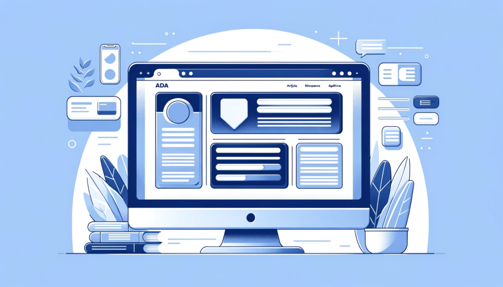
To know this, we must first understand what exactly ADA is!
The Americans with Disabilities Act (ADA) is a law from 1990 in the U.S. that protects the rights of people with disabilities. This law simply aims to provide digital equality and accessibility to disabled people.
ADA (Americans with Disabilities Act) compliance for websites is highly relevant both for website owners and users with disabilities.
Its significance can be viewed from two main perspectives:
Consider a website owner, why exactly should he/she make a website that is ADA-compliant? Here are the reasons:
- Legal Requirement and Avoidance of Litigation
- Increased Audience and Market Reach
- Improved Search Engine Optimization (SEO)
- Better User Experience for All
- Enhanced Brand Image and Social Responsibility
- Future-proofing the Website
Similarly, why should a person with disabilities or any user for that matter, use an ADA-compliant website? Let’s take a look at the reasons:
- Accessibility and Independence
- Inclusion in Digital Spaces
- Equal Opportunities
- Barrier-free Transactions
- Enhanced Safety and Emergency Information
Now that we understand the importance, need and relevance of an ADA-compliant website in today’s world, let’s quickly dive into the 10 most important components necessary to essentially make a website ADA-compliant.
Screen Reader Compatibility
I am sure we have all heard about the braille script, right? For those who haven’t, Braille is a form of written language for blind people, in which characters are represented by patterns of raised dots that are felt with the fingertips.
A screen reader does exactly that! Making a website compatible with a screen reader will allow people with visual impairments to access and interact with digital content by converting the text and images on a computer screen into speech, braille, or a combination of both.
A screen reader-compatible website, results in better-structured, cleaner, and more navigable websites for all users.
Now, that we have understood why this is an integral part of an ADA-compliant website. It is now time to see how exactly can this be achieved. Here are a few tips towards the same:
- Properly structure your website using semantic HTML5 elements. This includes using <header>, <footer>, <nav>, <main>, <section>, and <article> appropriately.
- Implement a clear hierarchy with heading tags (<h1> through <h6>) in a logical sequence.
- Provide descriptive alt text for all images. This helps screen reader users understand the content of the images.
- Use ARIA (Accessible Rich Internet Applications) labels to provide more context where needed, especially for interactive elements like buttons or links that might not have textual descriptions.
Finally, I would state that Screen Reader compatibility plays a vital role as a component of ADA-compliant websites by making websites accessible and readable.
Keyboard Navigation Support
We all use a mouse regularly in our computer systems. But what about the people who are not exactly blessed with the required motor skills to operate a mouse?
Then, how exactly are they supposed to navigate and browse through a website? The answer to that is of course, through using a keyboard.
Keyboard navigation benefits not only individuals with motor disabilities but also users who prefer keyboard shortcuts for efficiency, users with temporary injuries, and those who may not have access to a mouse.
Websites that are keyboard-navigable tend to have a well-structured and logical design, which enhances the overall user experience for all visitors.
Having said that, let us now look into some tips that can help provide keyboard navigation support for a website:
- Make sure all interactive elements (like links, buttons, and form fields) are focusable and can be navigated using the Tab key.
- Implement “skip to content” links at the beginning of the page, allowing users to bypass repetitive navigation links. Ensure these skip links are visible when focused on keyboard-only users.
- Design drop-down and other complex menus so they can be navigated using arrow keys.
- Ensure all form controls are accessible via the keyboard, including custom controls like date pickers or sliders.
To summarise, yes, ensuring that websites are navigable and usable via the keyboard is therefore not just a matter of compliance or ethical responsibility, but it’s also a practical approach to broadening access and improving the user experience for a diverse range of users.
Descriptive Link Text
Picture this – You see a link in a website and you do not understand what exactly it means or which part of the website it leads. This happens quite often to us, right?
Now, how exactly are people with visual disabilities supposed to navigate through a website like that? It is almost impossible.
This is where a Descriptive Link Text comes into the picture!
Descriptive link text in a website refers to the visible, clickable words used in a hyperlink that clearly describe the content or destination of the link.
The text should convey a clear idea of the destination or action. For example, instead of “Click here,” use “Read our privacy policy” or “Download the user guide.”
The link text should make sense even when read out of context. Screen reader users often navigate from link to link, skipping the surrounding text, so the link text needs to be understandable on its own.
Consider this text for a link to a website: “CLICK HERE”.
What do we understand from this? Why am I supposed to click in that area? What action is being performed on clicking on this text? – Nothing is understandable and is hence extremely vague and INEFFECTIVE.
On the other hand, consider this text for a link: “Download the HTML Basics eBook”.
Isn’t this link just perfect? You understand what to do and what action follows by clicking on the link. This is exactly the importance of a descriptive link text!
Hence, by using descriptive link text, a website can enhance its usability and accessibility, making it easier for all users, including those with disabilities, to navigate and understand the content.
Alternative Text for Images
While some of us can see images and get a pretty good visual understanding of certain things, what happens to visually impaired people? This is where Alternative text, commonly known as “alt text” comes into the picture.
Alt text provides a textual alternative to images on a website, which can be read by screen readers or displayed in place of the images if they fail to load.
Writing meaningful alt text is essential for creating accessible web content. Here are the best practices to consider when crafting alt text for images:
- Provide enough detail to convey the image’s purpose, but keep it brief (usually no more than a few words)
- For images that serve a function (like buttons or links), describe the function rather than the visual appearance. For example, use the “Submit button” or “Search” for a search icon.
- If an image is purely decorative and adds no informational value, use an empty alt attribute (alt=””).
- Skip phrases like “image of” or “photo of.” Screen readers typically announce images, so these phrases are unnecessary.
- Context is Key: Tailor the alt text to fit the context in which the image is used.
In summary, alt text is a critical component in making websites accessible, ensuring ADA compliance, and providing an inclusive and equitable digital experience for all users.
Transcripts and Captions for Multimedia
We just talked about text describing images, what about other forms of media like videos? Well, we are leaving no stone unturned! Transcripts and captions for multimedia do exactly that.
This refers to text-based methods of making audio and visual media content accessible to users with disabilities, particularly those with hearing impairments.
Firstly, let us understand “captions” and their types.
Captions are text versions of the spoken word and other important sounds that are in sync with the audio or video.
Captions are helpful for deaf or hard-of-hearing users to access audio content in any form.
Moving on, let us know what exactly transcripts entail:
Transcripts are textual representations of the audio content. They provide a complete, word-for-word account of everything that is spoken in an audio or video recording. These are particularly useful for:
- Users who are deaf or hard of hearing can read the transcript while listening to/watching the multimedia content.
- Users with cognitive or learning disabilities might find it easier to follow along with a written format.
- People who are in environments where playing audio is not feasible, or who prefer reading over listening/watching.
Here are some guidelines to achieve the same:
- Captions should accurately reflect the spoken words in the media and also identify speakers.
- Captions should convey all spoken words and include non-speech information such as the identity of the speaker and significant sounds (e.g., [laughter], [applause]).
- Format the transcript for easy readability. Use paragraphs, headings, or speaker labels to organize the text.
- If the transcript is separate from the audio or video, provide a clear link to it from the media, and ensure the link is easily accessible and identifiable.
- Follow a consistent style guide for captions and transcripts. This includes conventions on spelling, capitalization, punctuation, and describing sound.
- Regularly review and quality check the captions and transcripts to ensure accuracy and readability.
Thus, by adhering to these guidelines, website owners and content creators can ensure that their multimedia content is accessible to all users, including those with hearing impairments, thus complying with ADA requirements and enhancing the overall user experience.
Readable Fonts and Colour Contrast
Don’t we all love a beautiful, attractive website? Like when you open up a website and you just cannot stop using it because it somehow captivates all your attention!
Well, this can only be achieved by using impeccable fonts and some beautiful colors on the canvas of a website.
Font choice and color contrast are critically important elements of web design, especially for users with visual impairments. These aspects play a major role in ensuring the accessibility and readability of web content.
Some users with dyslexia find certain fonts easier to read. High contrast between text and background colors is essential for users with low vision. Insufficient contrast can make text difficult to discern, leading to eye strain and hindered comprehension.
Certain color combinations can be problematic for users with color vision deficiencies (color blindness). High contrast helps ensure that information is still discernible even if the color is not perceived as intended.
The Web Content Accessibility Guidelines (WCAG) provide specific standards for color contrast to ensure that text is accessible. Meeting or exceeding these standards is crucial for ADA compliance.
Having understood the wide range importance of these, let us quickly dive into some of the methods/tools that can be employed to achieve the same:
- WebAIM’s Color Contrast Checker: This tool allows you to check color contrast according to WCAG guidelines. You input foreground and background colors, and it evaluates the contrast ratio.
- Contrast Checker by Acart Communications: A simple tool to test color contrast and ensure it meets WCAG 2.0 standards.
- Google Lighthouse: An open-source, automated tool for improving the quality of web pages. It has audits for performance, accessibility, progressive web apps, SEO, and more, including color contrast checks.
- WAVE (Web Accessibility Evaluation Tool): This browser extension provides visual feedback about the accessibility of your web content, including contrast errors.
- Color Oracle: A free color blindness simulator for Windows, Mac, and Linux. It shows you in real-time what people with common color vision impairments will see.
In summary, careful consideration of font choice and color contrast is essential in making a website accessible and readable for users with visual impairments. These elements contribute significantly to the overall usability and inclusivity of digital content.
Consistent Navigation Structure
Let us say I open a website. I must have a look at the website and be able to understand at least the basic functionalities of it right?
For instance, by clicking on the user image generally at the top left corner of a site, I should be able to predict that this particular menu is for me to log in or log out to a website. This understanding comes from “predictability”, which is only made possible if there is a consistent navigation structure to the website.
Consistent navigation in an ADA (Americans with Disabilities Act) compliant website refers to the practice of maintaining a uniform and predictable navigational structure throughout the entire website.
When menus, links, buttons, and other navigational elements appear in the same place across pages, users can learn the layout more quickly and navigate the site with greater ease.
Users with cognitive disabilities, who might struggle with complex or abstract concepts, find it easier to use a site that has straightforward and repeated patterns.
Here are some strategies that can be employed to maintain a consistent navigation structure through a website:
- Use a standard header and footer on every page. This includes keeping the logo, navigation menu, and other key elements in the same location.
- The main navigation menu should be consistently placed and styled across all pages. The order of items in the menu should remain the same.
- Arrange content in a logical order, and use consistent headings and subheadings across similar pages. This structure aids users in predicting where to find specific types of information.
- Place similar types of content in the same area on each page. For example, if contact information is at the bottom of the home page, it should be in the same place on all other pages.
- Ensure high contrast between text and background colors and use readable fonts throughout the site, catering to users with visual impairments.
To sum up, consistent navigation in an ADA-compliant website not only ensures accessibility for users with various disabilities but also enhances the overall user experience by making the site more intuitive and easier to use for everyone.
Error Identification in Forms
“The only true error is the one from which we learn nothing.” – John Powell
Making errors or mistakes is a part and parcel of any development process. How we identify and correct these errors is what really matters right?
Identifying form errors and providing guidance for correction in an ADA-compliant website is of great importance for several reasons, particularly to ensure accessibility for all users, including those with disabilities. Here’s why it’s crucial:
People who use screen readers need clear error identification and instructions so they can understand what needs to be corrected. Without this, they might not even realize an error has occurred.
Clear error messages help them understand what is required without becoming overwhelmed or confused. It makes forms easier to use and navigate, improving the overall user experience and efficiency.
Let us now consider this: I enter the wrong email address in a certain part of the website. I will get the following error message: “Invalid Input”.
On seeing this, I have a clear understanding that an error exists. But I have no information about the error or its correction.
On the other hand, let’s say I get the following error message:
“Invalid input: Email address must follow the format ‘name@example.com’.”
Now I immediately know my fault and will be able to correct it in no time!
Some methods to employ effective error identification are as follows:
- Visually highlight the field with the error, such as changing the border color to red.
- Provide a summary at the top of the form listing all errors, ideally with each error linked to the corresponding field.
- Use proper HTML5 input types for different kinds of data (like ’email’ for email addresses).
- Clearly label each field, and provide instructions or examples where necessary.
- Provide clear confirmation that the form has been submitted successfully, such as a thank you message or a confirmation email.
To summarize, these practices ensure that all users, especially those with disabilities, can use forms efficiently and independently, enhancing the overall functionality and inclusivity of the website.
Compatibility with Various Assistive Technologies
The need for websites to be compatible with different types of assistive technologies is paramount for several key reasons, primarily revolving around accessibility, legal compliance, and inclusivity.
Many people with disabilities rely on assistive technologies (AT) like screen readers, speech recognition software, braille terminals, and alternative input devices to navigate the internet.
Designing for AT often results in cleaner, more navigable, and logically structured websites that benefit all users, not just those who use AT.
Here are a few methods for testing and ensuring the compatibility of websites with assistive technologies:
- Tools like WAVE (Web Accessibility Evaluation Tool), Axe, or Google Lighthouse can automatically check your website for common accessibility issues.
- Manually review your website’s HTML, CSS, and JavaScript code to ensure best practices for accessibility are followed.
- Test your website using popular screen readers like JAWS, NVDA (NonVisual Desktop Access), VoiceOver (for Mac and iOS), and TalkBack (for Android).
- Test with speech recognition software to ensure users can navigate and interact with your site using voice commands.
In summary, compatibility with assistive technologies is a critical aspect of web design and development, imperative for creating accessible, legally compliant, and inclusive digital content that is usable by the broadest possible audience.
Regular Accessibility Auditing To Stay ADA-Compliant
Regular monitoring and updating of a software/website are part and parcel of its development process.
Maintaining ADA compliance is not a one-time effort but a continuous ongoing process.
This process involves an evaluation of the accessibility of a website catering to every need of the users. It’s not just about ticking boxes; it’s about genuinely making the web a place for all.
The importance of keeping websites updated cannot be overstated.
Regular updates ensure that accessibility standards are continuously met as technology and user needs evolve. Think of it as maintaining a building’s ramps and elevators – it’s essential for enabling access to all.
In a nutshell, accessibility audits are the map, showing where improvements are needed, and regular updates are the journey, ensuring ongoing compliance and inclusivity.
Conclusion
Overall, all the above-mentioned 10 components aid in the development of an ADA-compliant website. These components exponentially improve the efficiency and accessibility of the website.
Developing an ADA-compliant website is about embracing inclusivity. ADA-compliant websites are important in making everybody feel welcome and enhancing equality on the web.
In this digital era, an ADA-compliant website is not just a legal necessity, but a moral imperative and a smart business strategy. It’s about opening doors, digitally, to everyone.